OUR WORK
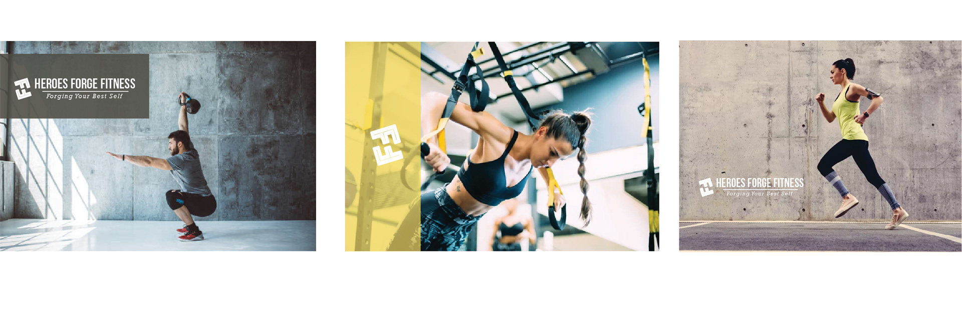
Visual Identity | Branded Apparel
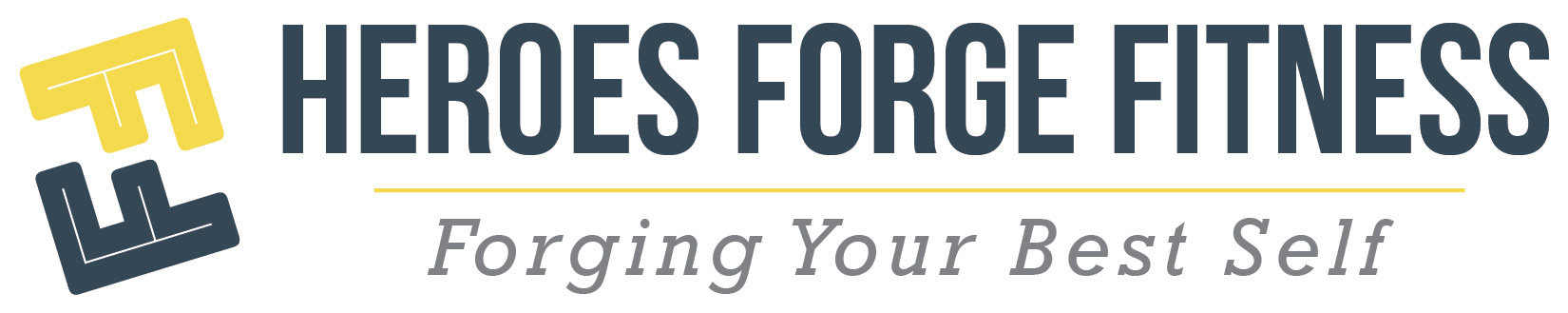
LOGO DESIGN
The “FF” concept in Forge Fitness branding emphasizes strength, momentum, and transformation. Rather than relying on a literal logo design, the idea of the double “F” becomes a symbolic foundation to stand for focus and fortitude, or forge and fitness. It captures the dual nature of pushing limits while building resilience. This conceptual approach creates a versatile brand story that can carry through visuals, messaging, and overall identity, reinforcing the idea that every step forward is part of forging a stronger self.
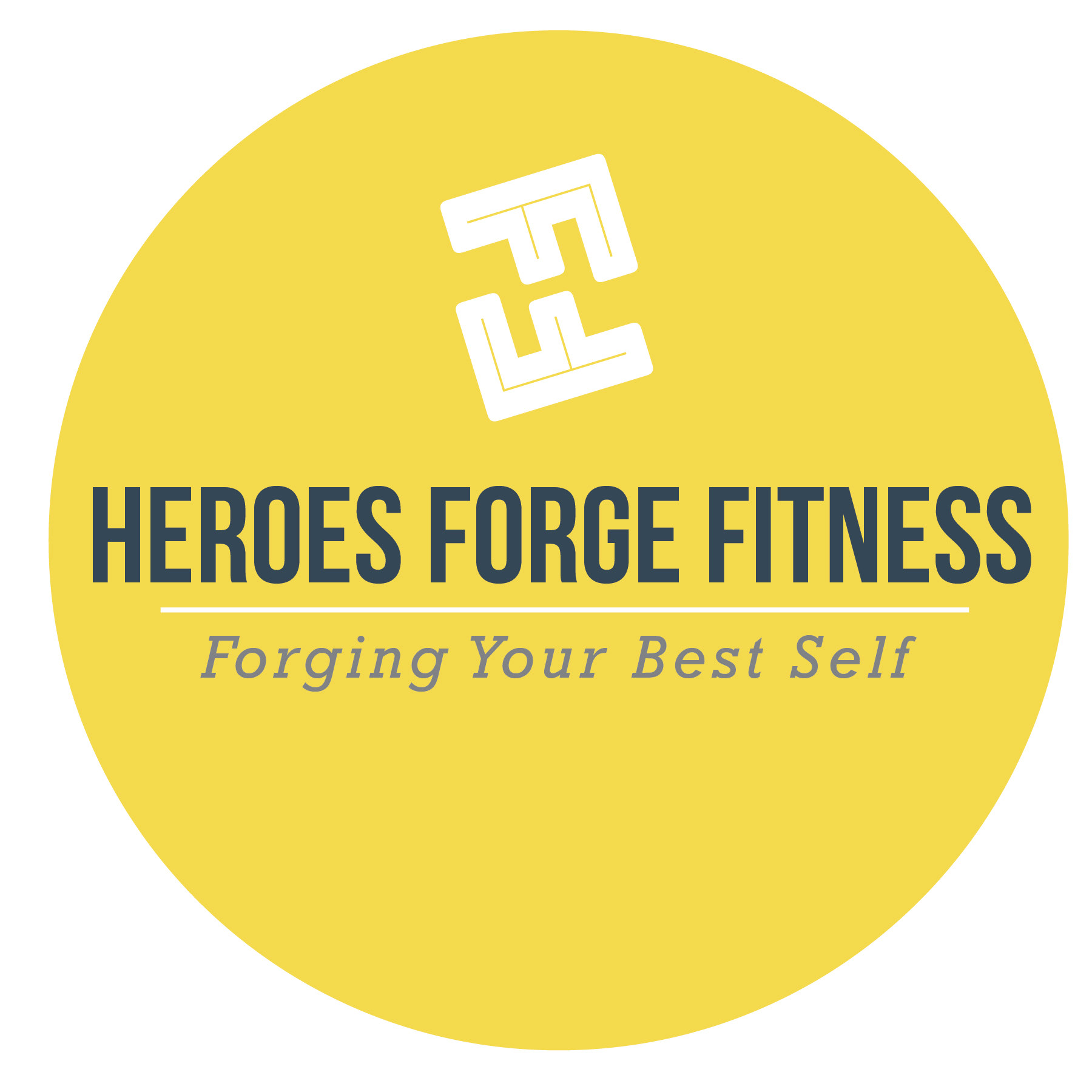
ALTERNATIVE VISUAL IDENTITY
We developed a set of alternative circle icons that stay true to the Forge Fitness brand while offering flexibility across platforms. These simplified marks carry the same bold energy and recognizable style, making them ideal for use on social media profiles, branded apparel, or other touchpoints where a full brand expression isn’t practical. By keeping the design cohesive but adaptable, the icons extend the brand’s presence in a clean, versatile way that reinforces recognition at every interaction.

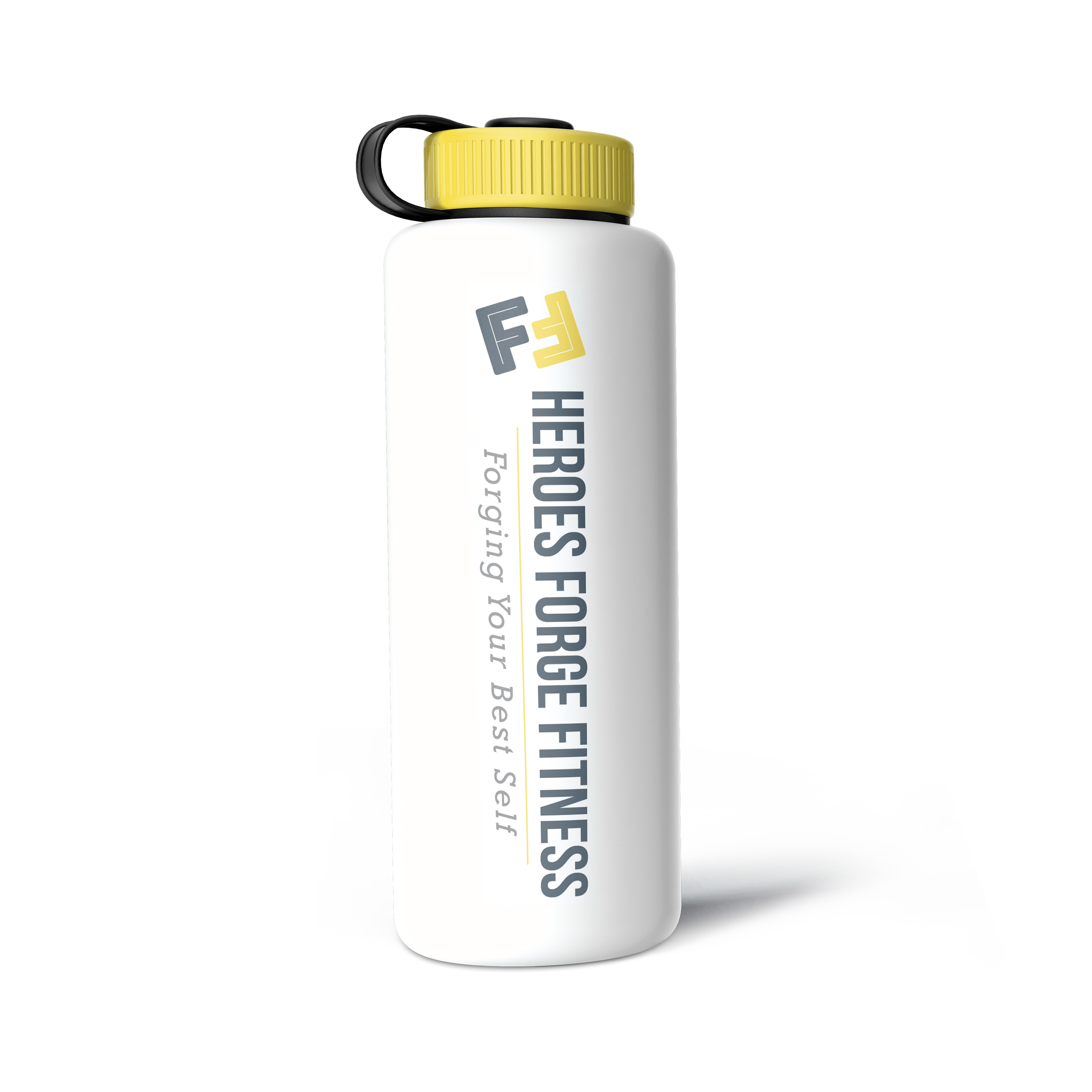
CUSTOM SWAG
Everyone who joins Forge Fitness receives a free water bottle, so we designed one that reflects the brand’s bold, motivating style. It’s both a practical tool for training and a daily reminder of the commitment to strength, resilience, and to stay hydrated!